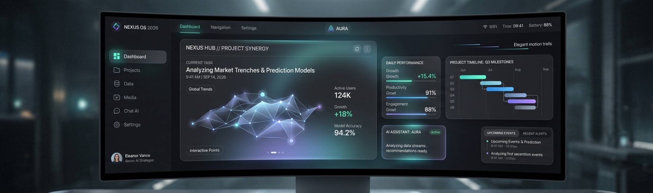
What started as a design preference has evolved into a core expectation of modern digital experiences. From AI-powered platforms to immersive mobile apps, dark mode remains one of the most influential interface trends of 2026.
But today, dark mode is no longer simply about aesthetics. It represents adaptability, emotional comfort, energy awareness, and personalized user experiences. Users expect interfaces that respond intelligently to context, while designers are challenged to create darker environments that remain accessible, expressive, and deeply human.
Let’s explore why dark mode still matters in 2026, how it shapes user perception, and the emerging principles defining the future of dark UI design.
The Psychology of Darkness: Calm, Focus, and Digital Wellness
Humans naturally react to light, contrast, and atmosphere. Dark interfaces create a different emotional response than bright ones—they feel immersive, focused, modern, and often more intimate.
In 2026, digital wellness has become a central part of UX design. As people spend more hours across screens, users increasingly prefer interfaces that reduce overstimulation and mental fatigue.
Dark mode helps create:
- A calmer visual environment for prolonged use.
- Reduced cognitive overload through softer visual intensity.
- A cinematic, premium atmosphere that enhances emotional engagement.
- Better focus by minimizing background distractions.
For many brands, dark mode has also become synonymous with sophistication, innovation, and modern identity.
Designers must remember: dark mode is not simply a visual style—it’s an emotional and psychological experience.
The Functional Benefits of Dark Mode in 2026
While dark mode continues to deliver aesthetic appeal, its practical advantages remain equally important:
- Reduces perceived eye fatigue in low-light environments.
- Improves battery efficiency on OLED and modern adaptive displays.
- Supports personalized accessibility preferences.
- Enhances focus during content-heavy or immersive tasks.
- Integrates seamlessly with adaptive operating systems and AI-driven interfaces.
However, modern UX thinking recognizes that dark mode is not universally superior. Context matters.
In bright environments, high-reading-density applications, or accessibility-sensitive interfaces, lighter themes may still perform better. The best experiences in 2026 prioritize flexibility rather than enforcing a single visual approach.
Readability and Contrast: Precision Over Pure Black
One of the biggest mistakes in dark UI design is assuming that “dark” simply means black backgrounds with white text.
In reality, readability depends on carefully balanced contrast.
Best practices in 2026 include:
- Using deep charcoal or softened dark tones instead of absolute black.
- Replacing pure white text with softer grays to reduce visual glare.
- Maintaining accessible WCAG contrast standards.
- Avoiding oversaturated neon colors that create visual vibration.
- Testing across HDR displays, foldable devices, tablets, and wearables.
Good dark mode design feels effortless to read. It should reduce strain—not create it.
Depth and Hierarchy in Modern Dark Interfaces
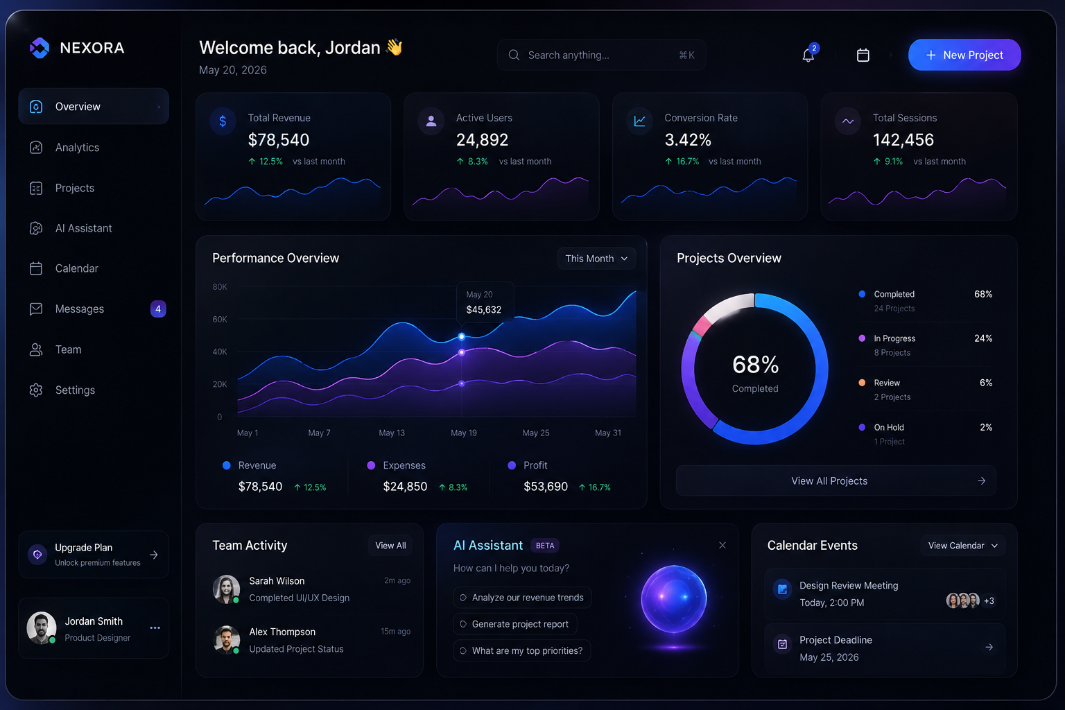
Visual hierarchy behaves differently in dark environments.
In light themes, shadows naturally define structure. In dark mode, designers rely more heavily on subtle tonal shifts, elevation systems, glow effects, and layered translucency.
To create effective hierarchy:
- Use tonal surfaces with slight variations in brightness.
- Add subtle blur, glassmorphism, or soft elevation effects.
- Highlight interactive elements with restrained accent lighting.
- Maintain strong icon visibility and edge definition.
- Create spatial separation without overwhelming contrast.
In 2026, dark interfaces are becoming more dimensional and atmospheric, moving beyond flat minimalism into richer, more tactile experiences.
Emotional Design: Creating Warmth in Dark Spaces
One challenge of dark mode is preventing interfaces from feeling cold or emotionally distant.
Modern dark UI design increasingly focuses on warmth and emotional balance.
Designers now incorporate:
- Warm accent palettes like amber, coral, copper, or muted gradients.
- Softer transitions instead of harsh contrasts.
- Ambient lighting effects and subtle motion.
- Organic micro-interactions that make interfaces feel alive.
The goal is not simply darkness—it’s comfort.
The best dark experiences in 2026 feel calm, elegant, and welcoming, like stepping into a thoughtfully lit environment rather than a sterile digital void.
Accessibility and Inclusive Design
Accessibility remains one of the most important conversations surrounding dark mode.
Some users experience visual discomfort when reading bright text on dark backgrounds, while others rely on dark themes for visual sensitivity or neurological comfort.
Inclusive design principles now require:
- Easy switching between light, dark, and adaptive themes.
- Respect for system-level appearance preferences.
- Dynamic semantic color systems.
- Careful testing for users with astigmatism or contrast sensitivity.
- Consistent readability across all viewing conditions.
Accessibility in 2026 is no longer treated as an optional enhancement—it is a foundational design requirement.
Brand Identity in the Era of Adaptive Themes
Dark mode should not erase a brand’s personality.
The strongest digital brands now build fully adaptive identity systems that work seamlessly across both light and dark environments.
To preserve brand consistency:
- Create dark-mode-specific color variants.
- Optimize logos and icons for darker surfaces.
- Adjust typography weight and spacing for improved readability.
- Maintain emotional consistency between themes.
Brands like Spotify, Netflix, and Tesla continue to demonstrate how dark mode can strengthen visual identity rather than dilute it.
Motion, Lighting, and Interactive Feedback
In darker environments, motion and illumination become more noticeable.
This makes animation and interaction design even more important in dark mode UX.
Modern interaction systems use motion to:
- Guide attention with subtle lighting cues.
- Create natural hover and feedback states.
- Smooth transitions between interface layers.
- Reinforce spatial awareness and depth.
In 2026, many interfaces combine motion design with adaptive lighting effects, making digital environments feel more responsive and tactile.
When carefully implemented, dark mode can create experiences that feel almost cinematic.
The Rise of Adaptive and Context-Aware Interfaces
The future of interface design is moving beyond simple light and dark toggles.
Modern systems increasingly adapt based on:
- Ambient lighting conditions.
- Device type and screen technology.
- Time of day.
- User behavior and energy preferences.
- AI-driven personalization.
Future interfaces may dynamically adjust:
- Brightness and contrast.
- Accent colors.
- Motion intensity.
- Typography weight.
- Visual density.
In 2026, the conversation is no longer “dark mode vs. light mode.”
It’s about adaptive experiences that intelligently respond to users and their environment in real time.
Conclusion: Designing for Comfort, Emotion, and Choice
Dark mode has matured from a visual trend into a fundamental part of digital experience design.
It combines aesthetics, usability, emotional comfort, accessibility, and personalization into a single adaptive ecosystem. When designed thoughtfully, dark mode empowers users to interact with technology in ways that feel natural, comfortable, and deeply personal.
The future of UI design is not about forcing users into one visual style—it’s about giving them experiences that adapt intelligently to their needs.
Because great design doesn’t simply look beautiful.
It understands people.