
In today’s digital marketplace, shoppers are no longer impressed by pretty websites—they expect experiences that are fast, seamless, and intuitive. E-commerce design in 2025 is not just about aesthetics; it’s about building trust, guiding emotion, and reducing friction from the first click to checkout.
The most successful e-commerce brands understand that every design choice—from button placement to product photography—affects how users feel and act. When done right, design becomes an invisible salesperson that moves customers naturally from browsing to buying.
1. First Impressions: Designing for Trust and Clarity
In e-commerce, first impressions make or break conversions. According to UX research, users form an opinion about a website within 50 milliseconds. That means your homepage or product page must instantly communicate credibility and purpose.
Key elements that build trust:
- High-quality visuals that reflect product authenticity.
- Clear value propositions that answer “Why buy here?”
- Visible trust signals like reviews, return policies, and security badges.
Brands like Apple and Glossier master this by blending minimal layouts with strong visual storytelling. Their sites are not crowded with features—they communicate confidence through simplicity.
2. Simplify the Shopping Journey

A smooth, predictable navigation system keeps users focused and reduces cognitive load. Shoppers should never feel lost.
Consider these best practices:
- Keep your main navigation simple (no more than 5–7 top-level links).
- Use breadcrumb trails to show users where they are.
- Ensure consistent filtering and sorting options across all product pages.
- Make the search bar prominent and smart—auto-suggestions, popular searches, and typo tolerance improve usability.
When the path to finding a product is clear, users are less likely to abandon their session. The goal: make browsing effortless so users can focus on deciding, not navigating.
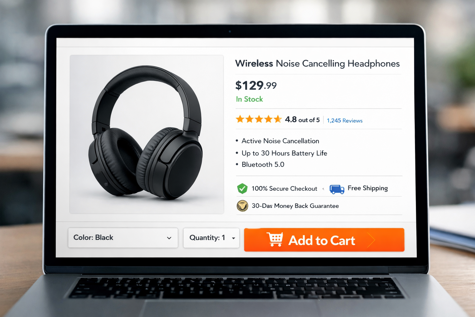
3. Product Pages That Persuade
Your product page is where intent meets decision. It’s the moment where storytelling, design, and psychology collide.
To convert effectively:
- Use high-resolution images with zoom and 360-degree views.
- Write concise, benefit-oriented descriptions (focus on how it improves the customer’s life).
- Add social proof: ratings, testimonials, and “people also bought” sections build trust.
- Include scarcity and urgency triggers, like limited stock notifications or countdown timers—used ethically, they motivate quick decisions.
Great product pages guide users emotionally. They don’t just sell—they help users imagine ownership.
4. Checkout: The Make-or-Break Moment
Nearly 70% of online shoppers abandon their carts before completing a purchase, often because the checkout process feels tedious or confusing. Streamlining this step can dramatically improve conversions.
Key checkout optimizations:
- Guest checkout option: Don’t force account creation.
- Progress indicators: Show users where they are in the process.
- Fewer form fields: Ask only for essentials.
- Multiple payment options: Include digital wallets (PayPal, Apple Pay, etc.).
- Clear error handling: Use real-time validation and helpful messages.
Every click in checkout should feel frictionless. When users sense control and transparency, they’re more likely to complete their purchase confidently.
5. Mobile-First E-Commerce: Designing for Thumbs
Over 70% of online purchases in 2025 happen on mobile devices. That makes mobile-first design the rule, not the exception.
Mobile UX essentials:
- Sticky “Add to Cart” buttons for quick access.
- Large, tappable touch targets and generous spacing.
- Vertical scrolling layouts instead of carousels.
- Simplified forms and one-tap payment options.
Design for the way users hold their phones—thumb-friendly layouts and intuitive gestures can make the difference between engagement and frustration.
6. Building Emotional Connection Through Design
Emotion drives decisions. E-commerce sites that trigger the right feelings—trust, excitement, joy—see higher conversion rates.
Use color psychology strategically:
- Red for urgency or sales.
- Blue for trust and reliability.
- Green for calm and reassurance.
Pair that with micro-interactions (like animated cart confirmations) and personalization, such as showing recently viewed items or greeting returning users by name. These small touches make the shopping experience feel tailored and human.
7. Data-Driven Optimization: Continuous Improvement
Designing an e-commerce experience isn’t a one-time task—it’s a process of constant learning and iteration. Use analytics and A/B testing to uncover user behavior insights.
Track metrics like:
- Conversion rate by device
- Cart abandonment rate
- Average session duration
- Heatmaps showing click and scroll activity
Tools like Hotjar, Google Analytics 4, and Optimizely help identify drop-off points and usability issues. A data-driven approach ensures every update you make directly improves user satisfaction and conversion potential.
Conclusion: Designing to Delight—and Convert
From browsing to buying, every interaction on an e-commerce site tells a story. The best online stores don’t push users to purchase—they guide, reassure, and inspire them.
By focusing on clarity, usability, trust, and emotion, you create an experience that turns casual visitors into loyal customers. In 2025, success in e-commerce isn’t just about selling products—it’s about designing experiences that convert through empathy, insight, and intentional design.