From the moment you land on the TWENTY TWO CARE homepage, there’s an unmistakable energy — an elevated simplicity that feels intentional, modern, and distinctly Asian. This isn’t just another skincare or grooming brand launching into an already crowded market. This is a brand born from lived experience — from barbershop floors, client chairs, behind-the-scenes consultations, and decades of understanding what Asian skin actually needs. What follows is the story of how TWENTY TWO CARE came to life online — through branding, user experience design, ecommerce strategy, and visual storytelling — creating a digital identity as thoughtful and refined as the products themselves.
More Than Products — A Cultural Narrative
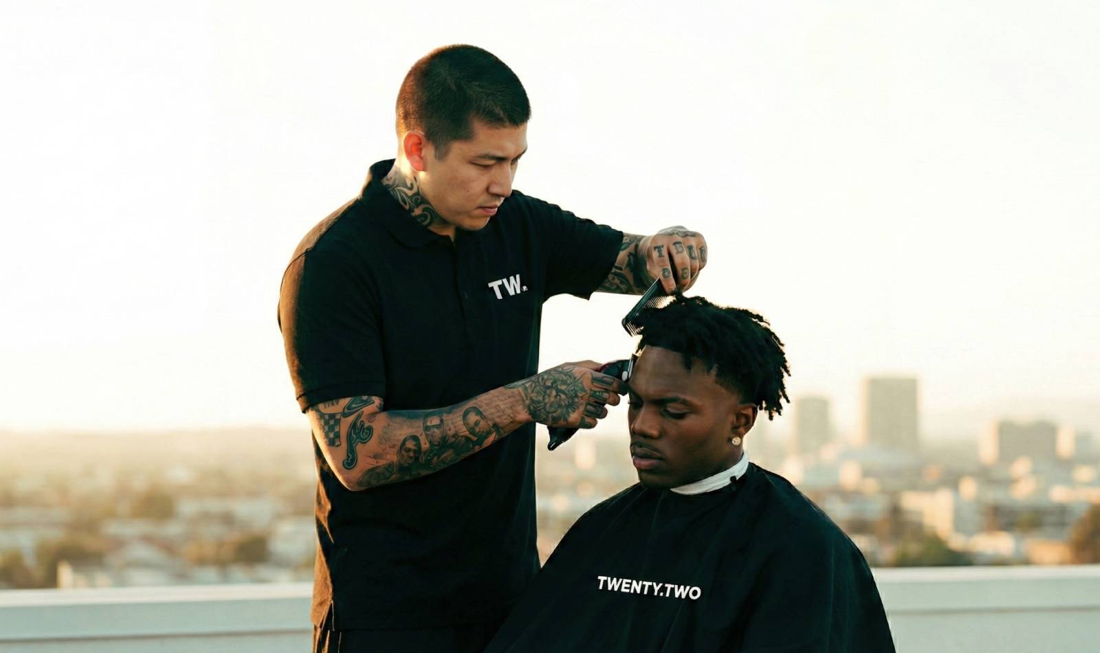
TWENTY TWO CARE didn’t begin with a list of ingredients or a trend chart. It began with people. A community — diverse yet unified — of Asian men and women who, for too long, navigated skincare that often misunderstood their goals, their concerns, their seasons, their cultural expressions of style and ritual. The brand’s originators were barbers: craftsmen of confidence, guardians of presentation, daily witnesses to a truth that’s easy to overlook — the face, hair, and body are personal terrains shaped by heritage, environment, and identity.
This insight became the brand’s north star. Every scent, every formula, every bottle curving in your hand is rooted first in empathy and second in expertise. But a brand this personal needed a digital presence that could carry its humanity — and that’s where the creative journey truly began.
Branding That Speaks Without Shouting
When we talk about branding for TWENTY TWO CARE, we’re talking about a language — visual, emotional, experiential — that resonates without relying on clichés. Many grooming collections fall into predictable aesthetics: cold luxury minimalism, loud masculinity, or trend-chasing maximalism. TWENTY TWO CARE charted a different course. The identity finds balance: warm restraint paired with quiet confidence. It whispers quality rather than screams it.
The logotype takes inspiration from precision and craft — think of the clean cut of a razor blade, the considered spacing of tools aligned on a station, the poised symmetry of grooming mastered. Yet there’s softness in the type, a subtle nod to the gentle care inherent in skincare and body rituals. The color palette echoes this same duality: grounded tones with soft accents that feel familiar, friendly, and suited to both men and women.
It was crucial that the brand identity communicate authenticity. There’s no masquerade of unattainable ideals, only refined realism — skin that’s alive, hair with texture, bodies that reflect real people. The visual language feels modern without feeling foreign, reflecting an Asian aesthetic that embraces both tradition and contemporary design sensibilities.
Designing an Experience — Not Just a Website

Once the soul of the brand was defined, the challenge was to express it digitally. Building the TWENTY TWO CARE website wasn’t about designing pages; it was about shaping a journey.
From the first hero image to the footer’s quiet reassurance of community and care, every screen was crafted with intention. The experience is familiar enough to feel comfortable for returning customers, yet guided and thoughtful enough to gently educate first-time visitors.
Navigation was designed with clarity — not clutter; choice without confusion. Products are organized in a way that feels intuitive rather than transactional. Body care doesn’t feel like an afterthought to face care; hair routines aren’t buried beneath fragrance collections; each category holds space with equal respect.
The UI elements follow this ethos too — soft borders, generous white space, and typography that speaks quietly but firmly. Interactive cues — like subtle hovers and micro animations — feel purposeful, never distracting. A scroll feels satisfying, not frantic. Buying feels empowering, not pressurized.
Behind the scenes, every clickable element, every category page, and every search function was optimized to keep the user in flow — the flow of discovery, understanding, and delight.
Ecommerce That Respects Time and Intention

The ecommerce strategy for TWENTY TWO CARE had to serve two primary needs: to convert and to educate. For many users, especially those newer to curated skincare and grooming regimens, products are not just items to buy — they are investments in self-confidence.
That’s why product pages go beyond specs. They invite exploration. Each SKU is accompanied by narrative context — what the product does, why it matters, how it fits into a ritual, what makes it especially suitable for Asian skin and hair types. Ingredient callouts avoid jargon, yet communicate authority. Usage guidance is practical and relatable.
The add-to-cart experience doesn’t interrupt the user’s flow — it supports it. Mini-cart overlays gently reassure without hijacking attention. Checkout is streamlined without being sterile, blending security with ease. Payment options anticipate regional preferences, and trust signals are woven naturally into the experience.
But perhaps most critical in the commerce experience is transparency. No hidden fees. No baffling terms. Just clarity, honesty, and a feeling that the brand is a partner — not a vendor.
Visual Storytelling Through Packshot and Product Photography
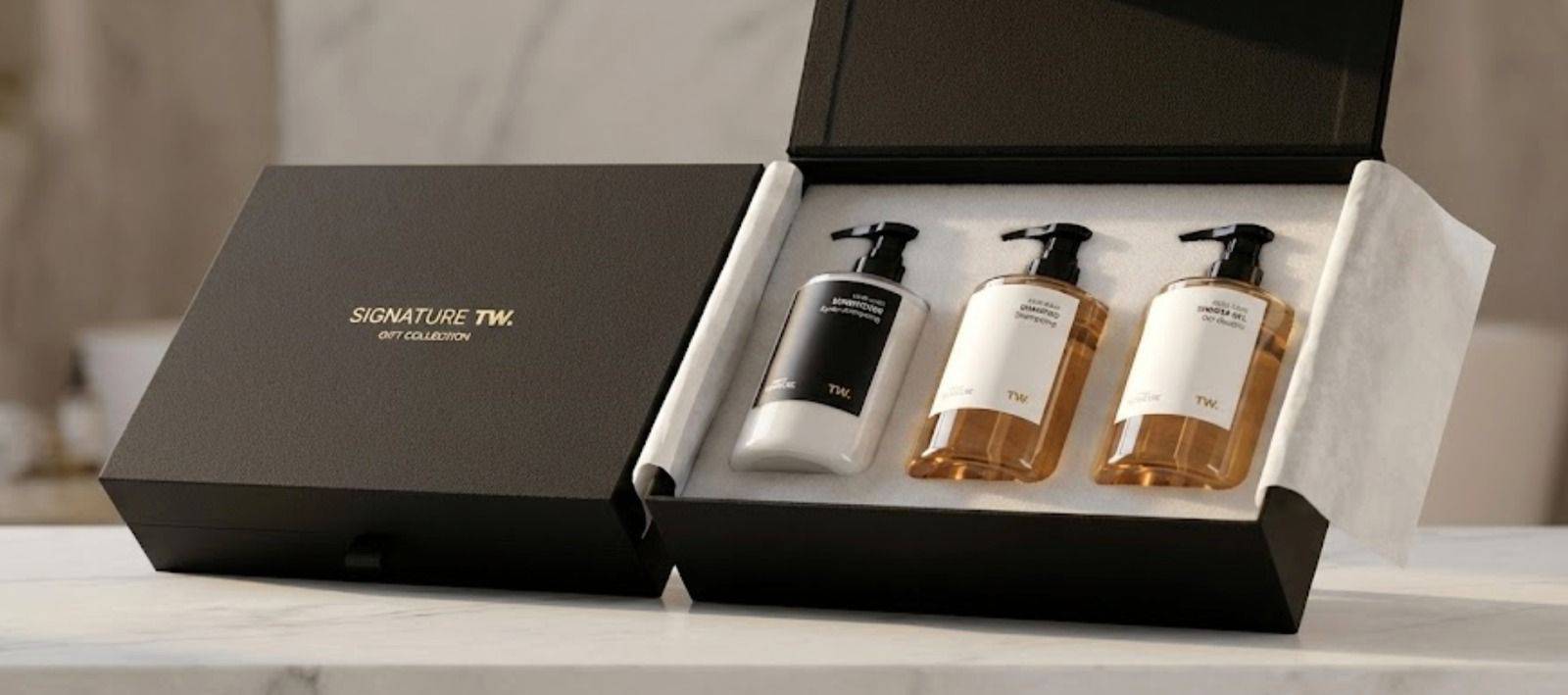
If the design and UX are the body of the brand experience, the product photography is its voice. Each packshot had to do more than show a bottle or jar. It had to evoke texture, evoke ritual, evoke aspiration.
The photography direction favored depth over gimmickry. Products are captured in light that reveals tactile details — the sheen of glass, the matte finish of labels, the subtle gradients of cream and serum. Shadows are soft, never stark. Backgrounds are minimal yet warm, allowing products to sit comfortably in their own visual space.
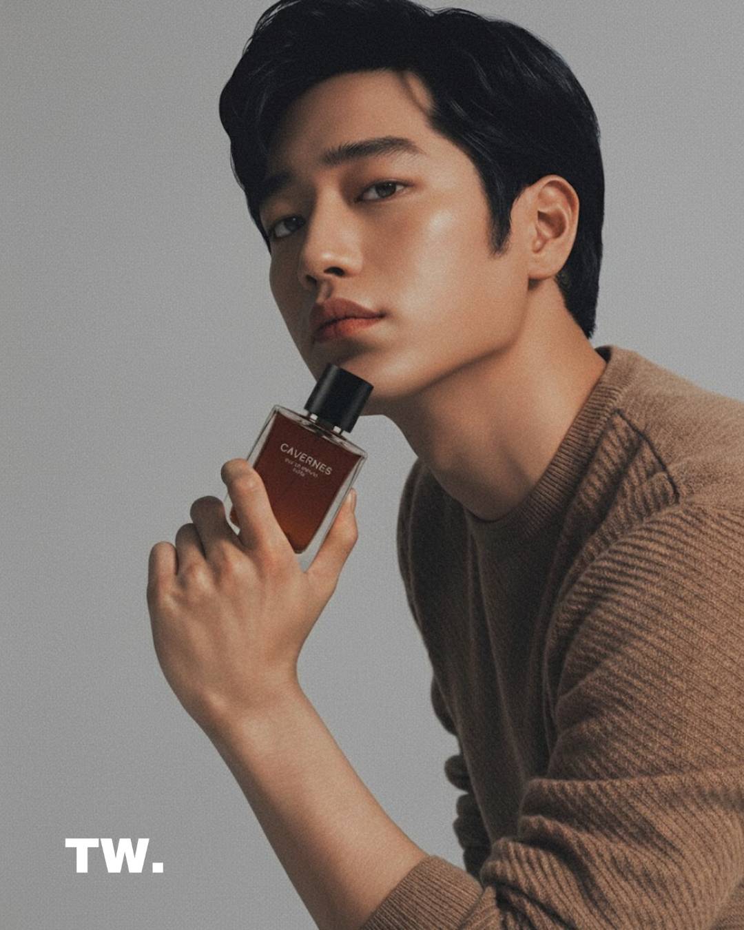
But more than technical beauty, the photography tells a human story. A body balm isn’t just photographed; it’s contextualized — suggesting warmth, touch, ritual. A hair tonic appears in dialogue with natural texture and movement. A fragrance bottle is framed in light that feels like memory — evoking spaces, experiences, and mood.
These visuals don’t just inform — they invite.
The Subtle Power of Story-Driven UX Copy
One of the most overlooked elements in digital experiences is copy — not the flashy slogans, but the everyday text that guides, reassures, and converses. For TWENTY TWO CARE, the voice needed to feel like a trusted friend and a skilled craftsman: informed but not arrogant; clear but not dull.
Product descriptions read like consultations. Category pages speak like guides. Microcopy — from button labels to form field hints — reflects care. There’s a rhythm to the words that mirrors the brand’s rhythm: calm, confident, considered.
The tone avoids overpromising. Instead of extravagant claims, the messaging focuses on results that matter: nourishment, resilience, clarity, comfort. For a user standing at the threshold between curiosity and purchase, this grounded voice fosters trust.
Bridging Culture and Community Online
TWENTY TWO CARE’s growth isn’t built on impulse buys or seasonal hype. It’s rooted in real conversations happening in barbershops — the birthplace of the brand. These conversations transcend trends. They are about self-expression, acceptance, care, and identity.
The digital platform carries that same ethos. Social integrations and user-generated content reinforce the feeling of community — authentic faces, real experiences, shared stories. The brand doesn’t just claim to understand Asian skin and hair; it showcases the lived experiences of people from the community it serves.
Blog content, guided routines, editorial features — all feel like invitations to belong, not sales copy in disguise. They emphasize education over persuasion, connection over conversion.
A Harmonious Symphony of Design, Commerce, and Culture
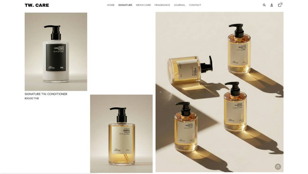
Looking back at the final product — the completed TWENTY TWO CARE digital experience — what stands out most is coherence. It would have been easy to build a beautiful website that feels disconnected from culture. It would have been easy to create a sleek ecommerce site without depth. It would have even been easy to produce stunning photography that lives apart from brand values.
But the real achievement lies in unity — in how every design choice, every line of copy, every visual element serves multiple purposes: to delight the user, to embody the brand’s identity, to educate without overwhelming, and to honor the community at the brand’s heart.
In an era where many products chase virality, TWENTY TWO CARE chooses authenticity. In a landscape crowded with empty promises, it offers clarity. And in a world where digital experiences often feel transactional, it crafts something deeply human.
For anyone stepping into the world of TWENTY TWO CARE — whether for the first time or as a returning customer — the message is clear: this is more than a brand. It’s a reflection of community, crafted with care, and delivered with intention.
Visit the website: https://www.