A successful digital experience goes beyond good looks—it connects emotionally. Every shape, color, and animation in a user interface (UI) communicates feeling. Whether it’s excitement, calm, or trust, emotional design transforms static screens into meaningful interactions.
In 2025, where attention spans are short and competition fierce, understanding the psychology behind UI choices is no longer optional—it’s essential. Emotional design bridges the gap between usability and desire, making users not only use your product but feel connected to it.
The Science of Emotional Design
The theory of emotional design was introduced by Don Norman, who defined three levels of emotional response to design:
- Visceral Level – The immediate, instinctive reaction to visual appeal. Users decide in seconds whether a product feels trustworthy or confusing.
- Behavioral Level – The experience of interaction. Smooth navigation, intuitive layouts, and satisfying feedback make users feel capable and in control.
- Reflective Level – The emotional aftertaste. This is where users form long-term opinions, like “That app feels so easy to use” or “I love how this website makes me feel.”
The best UI design addresses all three. It attracts attention, functions seamlessly, and leaves a lasting emotional impression.
Color Psychology: Designing with Emotion in Mind
Color is one of the strongest emotional triggers in design. Each hue speaks a psychological language:
- Red – Urgency, passion, excitement. Often used for sales buttons or alerts.
- Blue – Calm, trust, stability. Common in finance, health, and tech brands.
- Green – Growth, health, balance. Ideal for eco-friendly or wellness platforms.
- Yellow – Optimism, creativity, warmth. Great for youthful, energetic designs.
- Black – Power, elegance, sophistication. Perfect for luxury or premium brands.
For example, PayPal’s blue evokes security and reliability, while Netflix’s red creates energy and urgency. The right palette doesn’t just look good—it subconsciously influences behavior.
Typography and Shape: The Subtle Psychology of Form
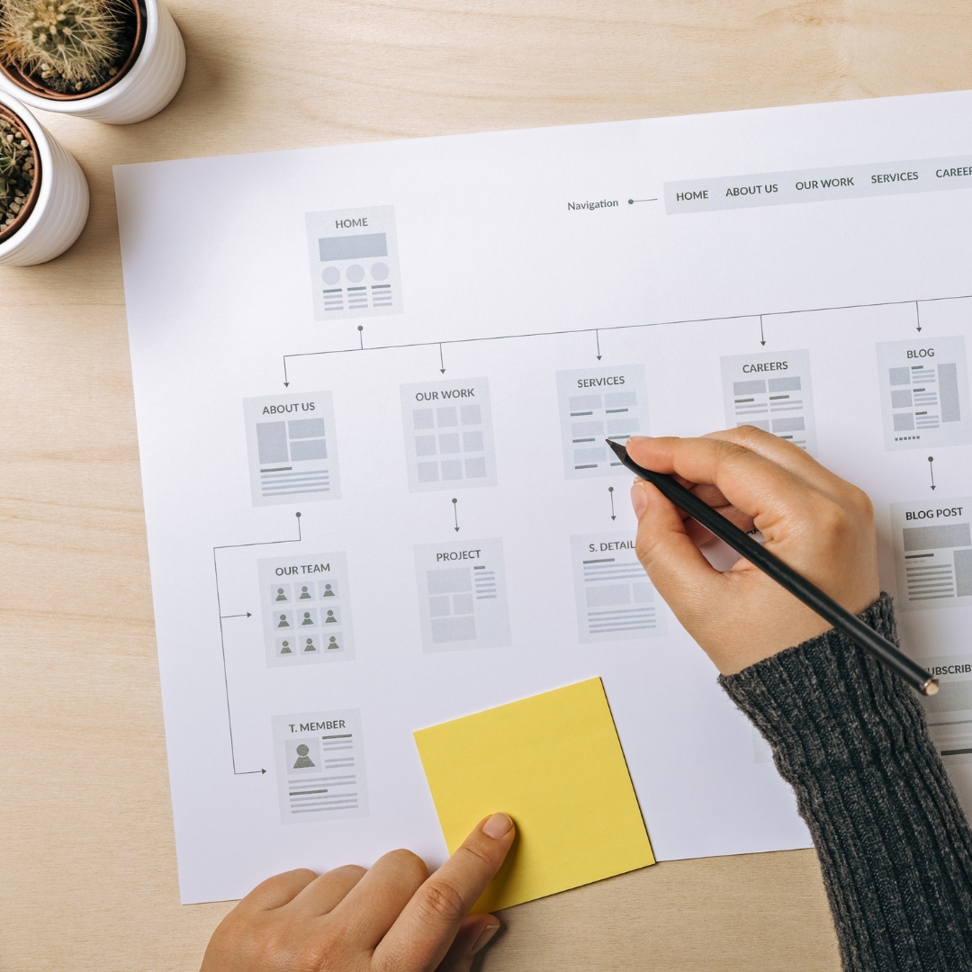
Beyond color, typography and shape shape perception. Rounded fonts and buttons feel friendly, while sharp edges suggest efficiency and confidence. Serif fonts (like Times New Roman) create a traditional, trustworthy vibe; sans-serif fonts (like Helvetica) feel clean and modern.
Designers can use typography hierarchy—large, bold headings for emotion, balanced text for clarity—to guide attention. Similarly, curved buttons invite clicks, while straight edges imply professionalism. Each line, curve, and font carries emotional weight.
Micro-Interactions: The Joy of Small Details
Tiny animations and feedback moments—called micro-interactions—play a huge emotional role. They make technology feel human.
Think of a heart icon that fills with color when clicked or a button that subtly expands when hovered over. These details trigger dopamine, the brain’s reward chemical, giving users a sense of accomplishment.
Platforms like Slack and Asana excel here—celebrating small wins with animations, sound effects, and gentle motion. These design touches keep users emotionally engaged and delighted.
Visual Hierarchy: Guiding the User’s Journey
Visual hierarchy helps users focus on what matters. It’s the designer’s way of saying, “Look here first.”
By playing with size, color contrast, and spacing, designers can direct attention toward key actions—like sign-ups or purchases—without feeling pushy.
Users naturally scan in an “F-pattern”: top to bottom, left to right. Aligning headlines, images, and call-to-action (CTA) buttons along this visual path increases clarity and conversions.
A strong hierarchy doesn’t just organize information—it shapes emotional flow, turning confusion into confidence.
Motion and Animation: Bringing Emotion to Life

Animation adds a layer of empathy and energy. Motion can communicate feedback, signal progress, or simply make an interface feel alive.
A loading animation that transitions into a smiling icon reassures users. A button that bounces softly on click adds joy. Even subtle transitions between pages can create a sense of smoothness and care.
The key is balance. Overly flashy animations can feel distracting, but well-timed motion enhances emotional connection—making users feel seen and understood.
Building Trust Through Empathy
Ultimately, emotional design is rooted in empathy. Understanding user needs and emotions allows designers to craft experiences that resonate.
A healthcare app using calming tones and gentle interactions fosters trust. A travel website with lively imagery and playful motion inspires excitement. Every design decision should reflect how users want to feel.
Consistency is also crucial. When your website, app, and even emails express the same emotional tone, users perceive your brand as authentic and reliable. That emotional consistency drives loyalty more than any marketing tactic.
Conclusion: Designing for Emotion Is Designing for Action
In UI and UX, logic guides design—but emotion drives decisions. Emotional design blends psychology with creativity, turning interactions into experiences and users into advocates.
When users feel good, they act. They click, share, subscribe, and return. That’s the magic of emotional design—it transforms functionality into feeling, and feeling into action.